mimik
— 5 min read
About
mimik provides a SDK platform to third-party developers that enables devices to create distributed edge-cloud clusters by physically discovering and establishing peer to peer connection between one another.
This technology enables ad-hoc and real-time formation of mesh networks across different devices, operating system, and network connections.
The team had developed the initial version of edgeSDK and were considering if they could increase sales by creating an consumer app that would demonstrate how the SDK worke under the hood. I initially joined the team as a designer to help craft the user experience of the demo app, and grew into a Product Management role as time went on.
Decompose
By sharing a short survey and follow up interviews with the existing user base and stakeholders we learned that:
-
No data or understanding about who the SDK was for, or who app users are, their behavior, or impressions of application and which features mattered most.
-
The team had created many proof of concept works to engage potential customers but would not result in a sale because there was no clear definition of which functionality the SDK currently supported.
-
App use cases could not be fully defined without a SDK road map to indicate when app features could be enabled.
-
Most internal and external users did not have the latest versions of the application or know how to easily install them.
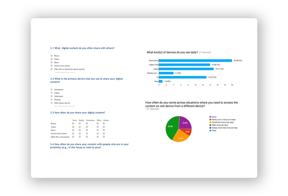 Capturing insights about the current user's media sharing habits
Formulate
This insight left the team with more questions than answers so we set out to learn:
- How could we map customer values to company vision?
- How could we involve SDK customers in design process to validate ideas?
- How do we compare different ideas that have multiple factors?
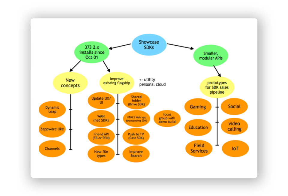 Evaluating different opportunities to showcase the edgeSDK.
Define
- Conduct surveys and interviews to learn about user needs and expectations towards personal storage and media sharing applications.
- Test 3-5 value proposition with 100 existing app users (80% who are potential SDK customers) in 2 weeks.
- Run 1 week design sprints to test 4 different prototypes with SDK partners in 8 weeks.
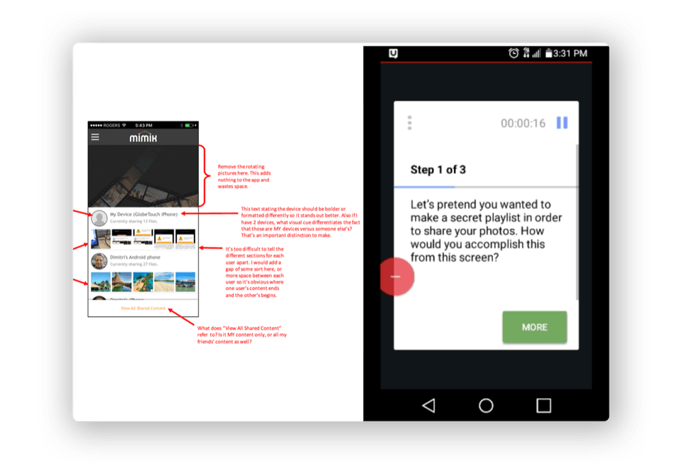 Capturing and summarizing qualitative feedback collected from usability tests of the current design.
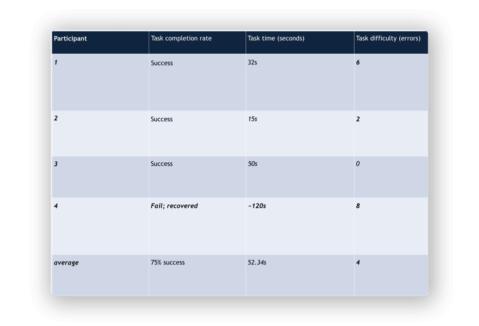 Displaying results of quantitative data collected from task completion tests conducted on the current app design.
Running the experiments
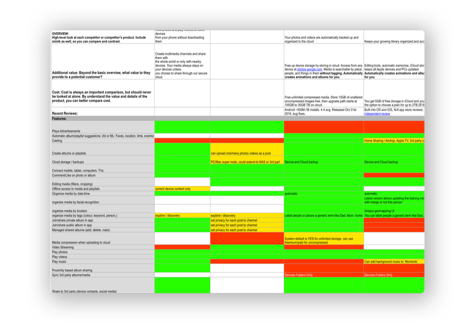 Conducting a high-level competitive analysis quantified values and functionality other services offered. This provided an initial framework for evaluating opportunities currently missing from mimik access and what value would be provided to end users.
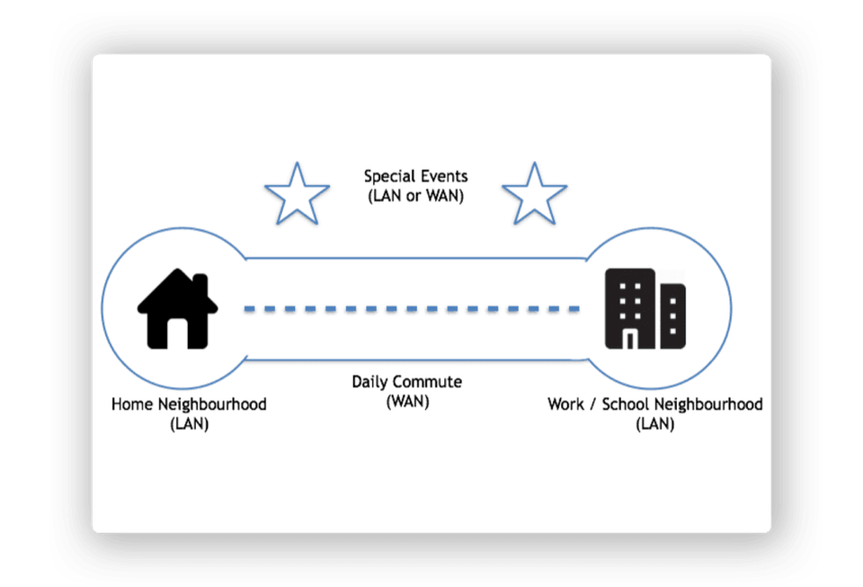 The initial edgeSDK could only discover and connect with devices on the the current local network. Survey results identified 4 common environments for creating and consuming their personal media.
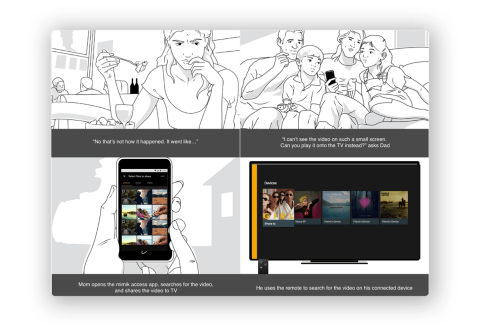 Storyboards were developed with Indigo Studio to simulate the experiences for the value proposition being tested.
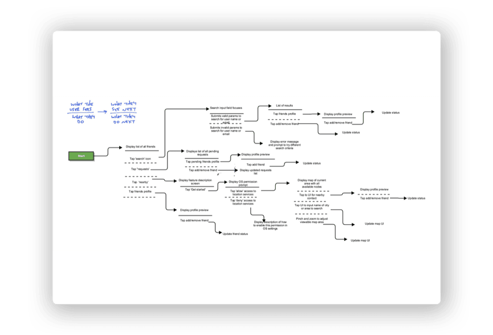 A collaborative approach to designing complex UI flows with a shorthand form document. This low-fidelity approach allowed us to co-create and maintain entire sets of flows that need to be designed in higher fidelity, tested, revised, implemented, tested, and retested.
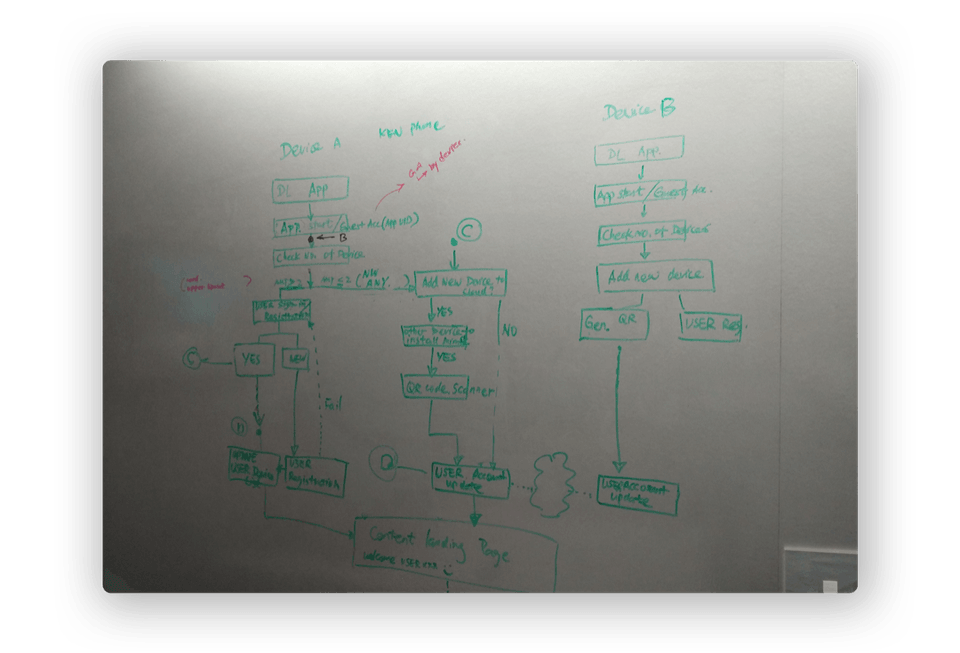 Flow diagram for how micro-services running on different edgeSDK enabled devices would interact in media sharing scenarios.
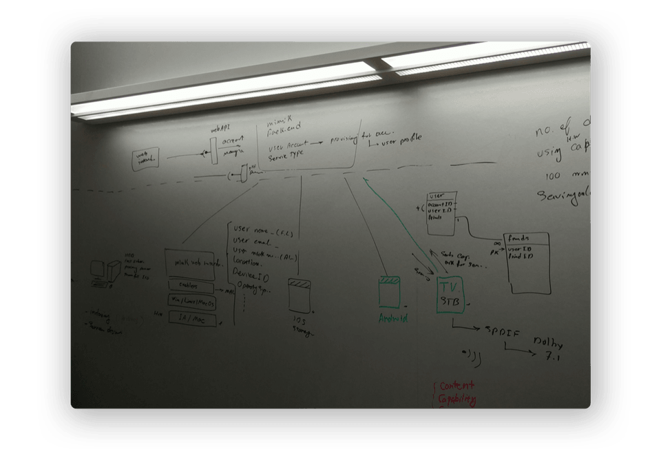 Topology of back end services, mobile devices and television set-top boxes (STBs) discovered, connected, and communicated with each other.
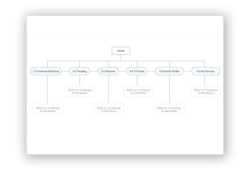 Sitemap of the TV application integrated mimik access functionality with a partner's digital TV services.
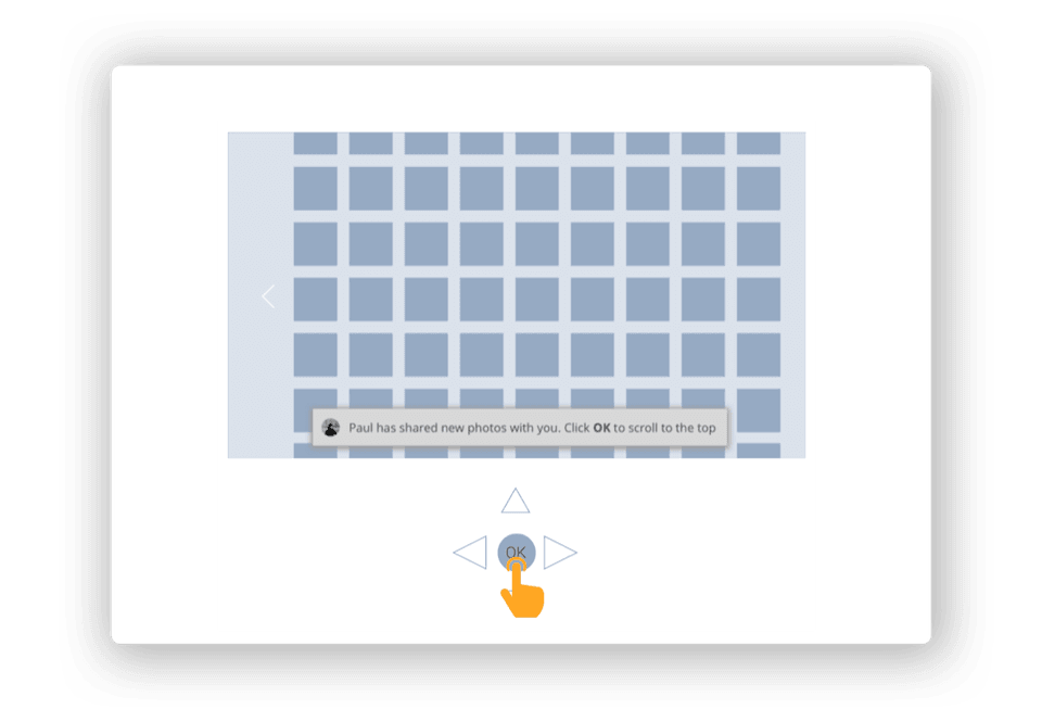 Wireframes of user interactions using a remote control to browse their personal media library.
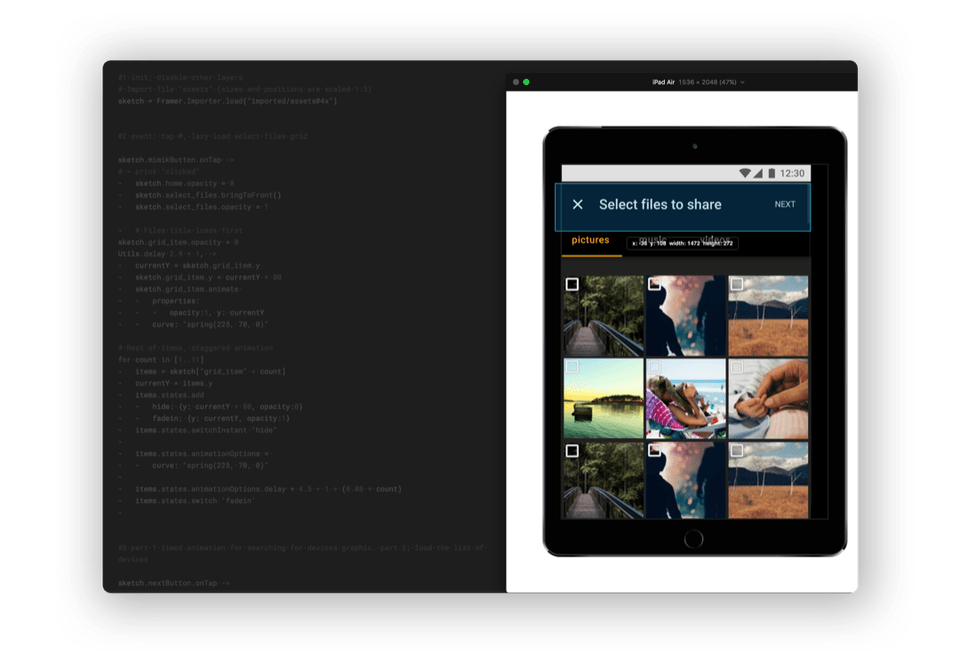 Framer Classic prototypes were developed to test user task completion rates using real devices and data.
Verify the results
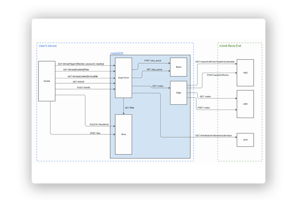 Architecture diagram displaying how the access application interfaces with the edgeSDK, how edgeSDK instantiates micro-services based on user action, and how edge micro-services utilized the mimik back end infrastructure.
As a result, the team and I were able to challenge our initial assumptions for creating the mimik access applications. This shift in thinking helped us to:
- Increase SDK installations by 8% with the release of mimik access application and source code.
- Create a active presence on GitHub and SwaggerHub which helped reduce setup times for edgeSDK customers down from 1 week to 1 hour.
- Assist sales by creating an demo environment to showcase the application and SDK to prospective customers on a variety of devices, network connections, and different media formats.
- Prepare documentation, proof-of-concepts, and code examples to enter new market vertical such as: digital TV services, health care, drone surveying, smart cars and cities, and industrial IoT infrastructure.
View more of my work or send a message to learn more.