oYYo
— 4 min read
About
As the Design Co-founder of oYYo, one of my first goals was onboarding 100 beta testers in 1 month.
Eligible participants received a free local phone number enabled for unlimited international voice calling and text messaging. Participants could use their phone number on cellular networks as well as WiFi, using their mobile phones, laptops, tablets, and web browsers.
Decompose
Working with 30 existing participants, I organized observation studies and user interviews to learn the following:
-
Who are the key user groups?
-
What are participant's behaviors, attitudes and expectations towards oYYo?
-
What are their needs and behaviors?
-
How are people using existing/competitors’ product?
-
What barriers hinder users from using oYYo daily?
-
Would they be willing to refer oYYo to friends and family?
-
What amount per month would they pay for a service like oYYo?
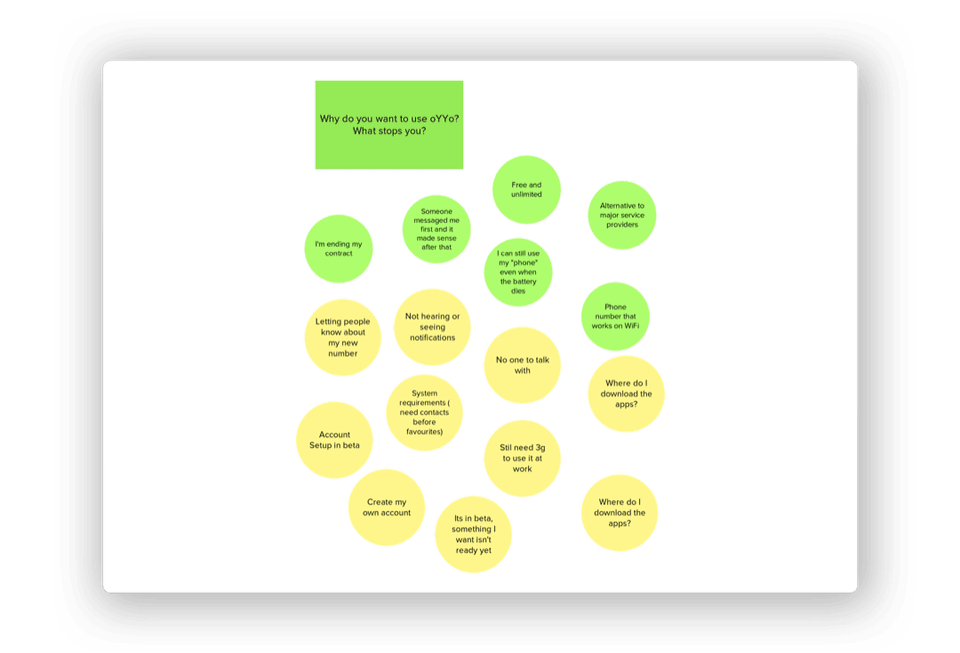 Capturing and sharing insights from interviews and observations with a remote team
Formulate
After conducting a series of interviews and observation studies I learned that:
-
There was no landing page or sign up form. Leads came from word of mouth and referalls. This often caused different understandings and expectations of what the service actually offered participants.
-
There was no way to qualify if a lead was eligible to become a tester. Our upstream service provider had limitations on which countries they could provision new phone numbers for.
-
Account configuration was a manual and time intense process for the team. Lost leads reported losing interested because there was no communication about what the next steps were or when they would happen.
-
New activations were unclear on how to start using the service or where to download an app for their other devices.
-
There was no official channel to report issues if the service went down or when they needed information on how to use it.
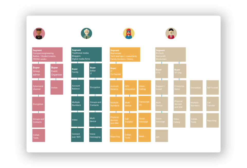 Personas helped us prioritize feature development user needs across multiple segments in relation to their setup cost and life time value
Define
Journey maps were created to have the team identify what needed to happen behind the scenes events when users interacted with touch-points of the service:
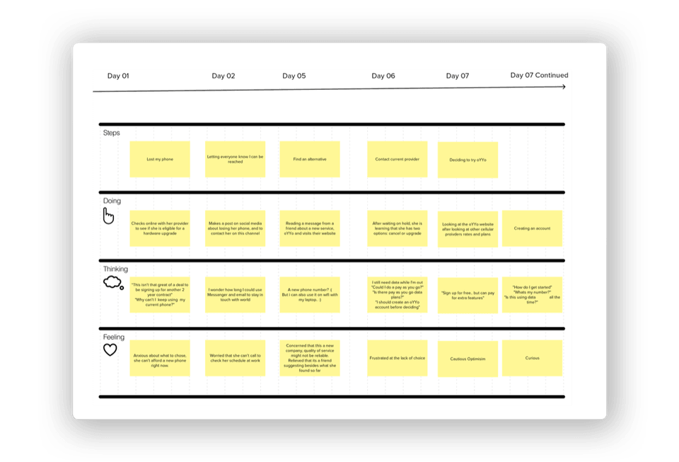 Journey maps helped our team have a clear picture about which services and touch points would help onboard new participants.
We brainstormed on creating the smallest version of our on-boarding process so that feature development could run parallel to recruitment of participants to test the next major oYYo release:
- Would sharing our registration page through our beta apps on Google Play and Chrome Apps generate more than 100 registrations in 14 days?
- Could we reduce the amount of lost leads by automatically new registrations short eligibility survey?
- Would activation increase if eligible participants are sent their activation link after receiving their surveys?
- Would retention improve each week if the team acted as 'support bot' that sends an initial welcome and instructions on using the service, such as downloads and support?
Running the experiments
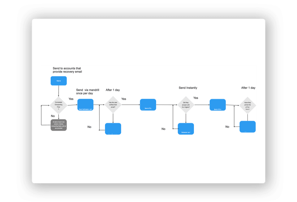 An early process diagram for automating the account verification, configuration, and activation requirements.
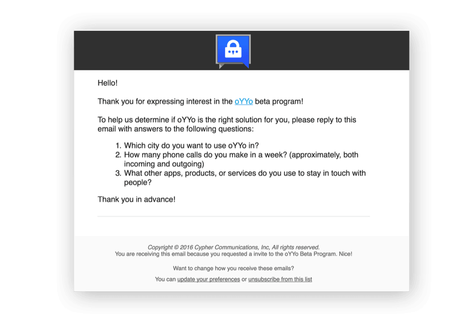 The eligibility survey sent to new sign-ups collected mandatory quantitative and qualitative data required for account configuration.
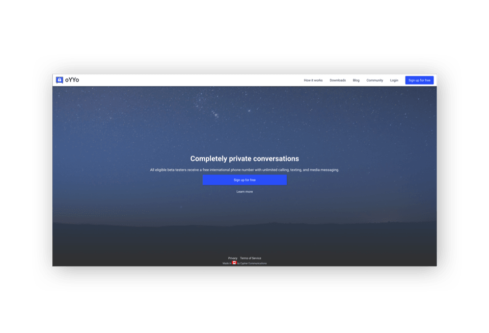 A registration form, downloads section, and support materials were added to the oYYo website.
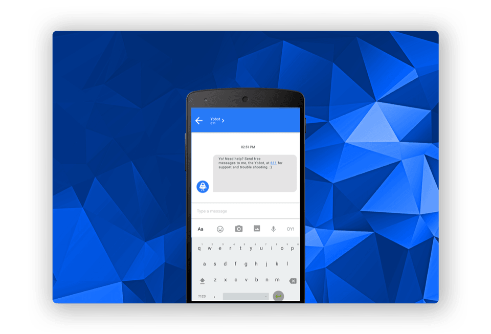 The first iteration of Yobot was message the team sent manually to new accounts prior to activation that said "Please reply to this message to get started."
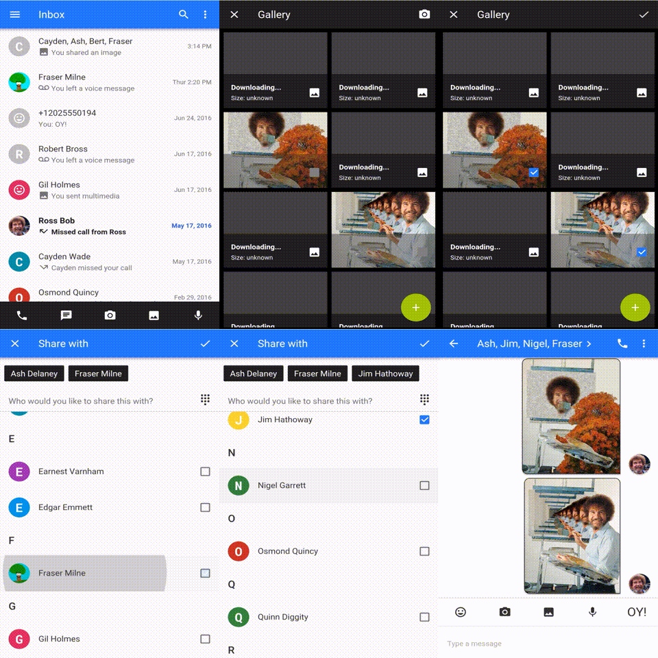
After each release, Yobot shared short video clips demonstrating new features and a link to our downloads page.
Verify the results
Because we were able to validate this set of challenges, our initial results were impressive:
- The registration form bundled in the public beta release of our Android and Chrome apps received 3000 visitors and 240 new sign-ups within 5 days of being released.
- The verification process sent 70 account activation links in the first day of being released.
- Almost everyone replied to the welcome message from the team. This was a great opportunity to help each user get started within their first 15 minutes.
- Over the next three months we had over 3000 international users with a 30% activation rate within 24 hours
View more of my work or send a message to learn more.